|
UI Styles |
 Where to find it:
 Main Window / Edit / Preferences / Misc / UI Style
|
|
Changes to the User Interface Style require a Mari Restart to take effect |
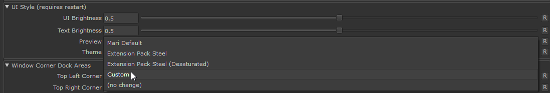
You can adjust Mari's UI Brightness and sty;e to your personal liking via the Misc. Tab of the Mari Preferences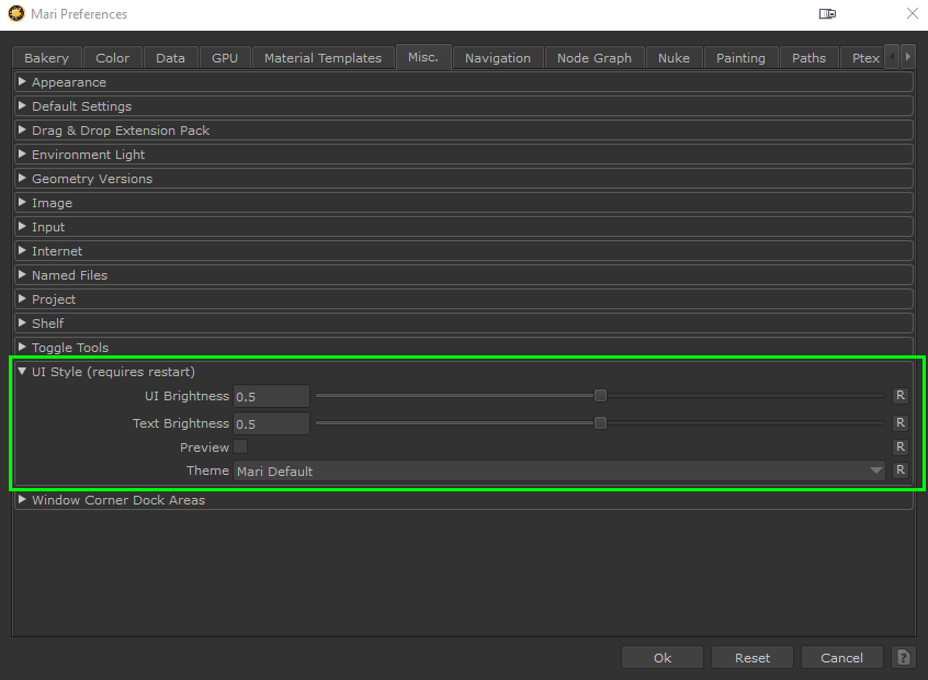


|
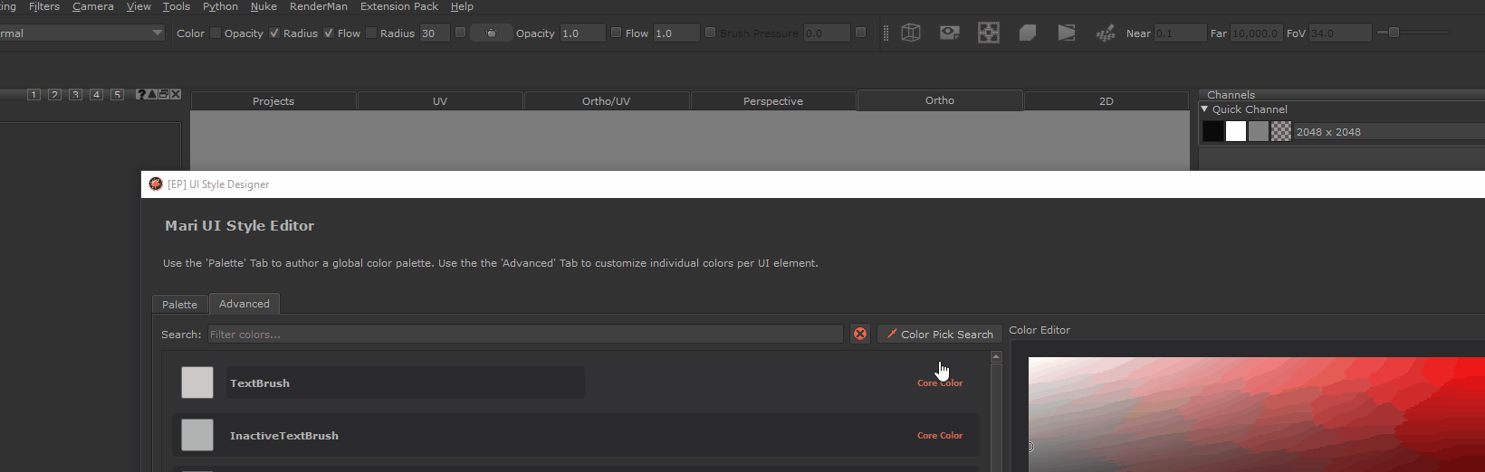
Style Designer (Custom Themes) |
The "Style Designer" can be opened by choosing the "Custom" option in the Theme Dropdown Menu. It allows you to customize the internal Color Palette that Mari uses to draw its User Interface. You can customie the Palette globally, or drill down and
adjust different UI elements (e.g. buttons, lists etc.) separately.
|
|
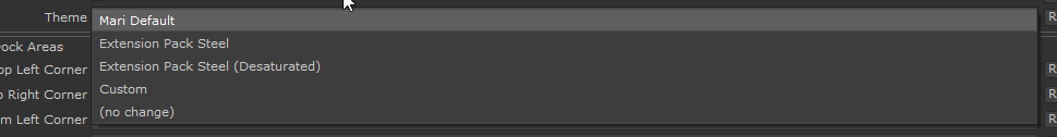
Style Customizations will be based on whatever theme was selected before. So if you had chosen "Extension Pack Steel" as a theme before opening the Style designer, its theme will be used as the base |
|
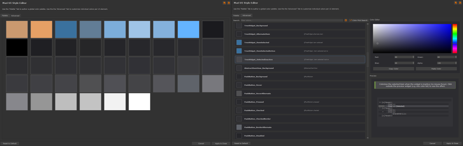
Palette Tab |
Adjusting the global Color Palette is the easiest way to customize your User Interface, without worrying about tweaking individual Interface elements.
Simply click on a color and modify all assigned UI elements simultaneously.

|
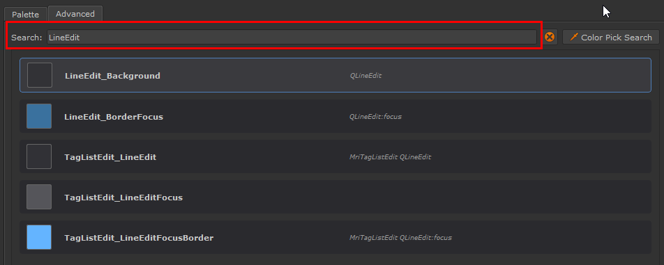
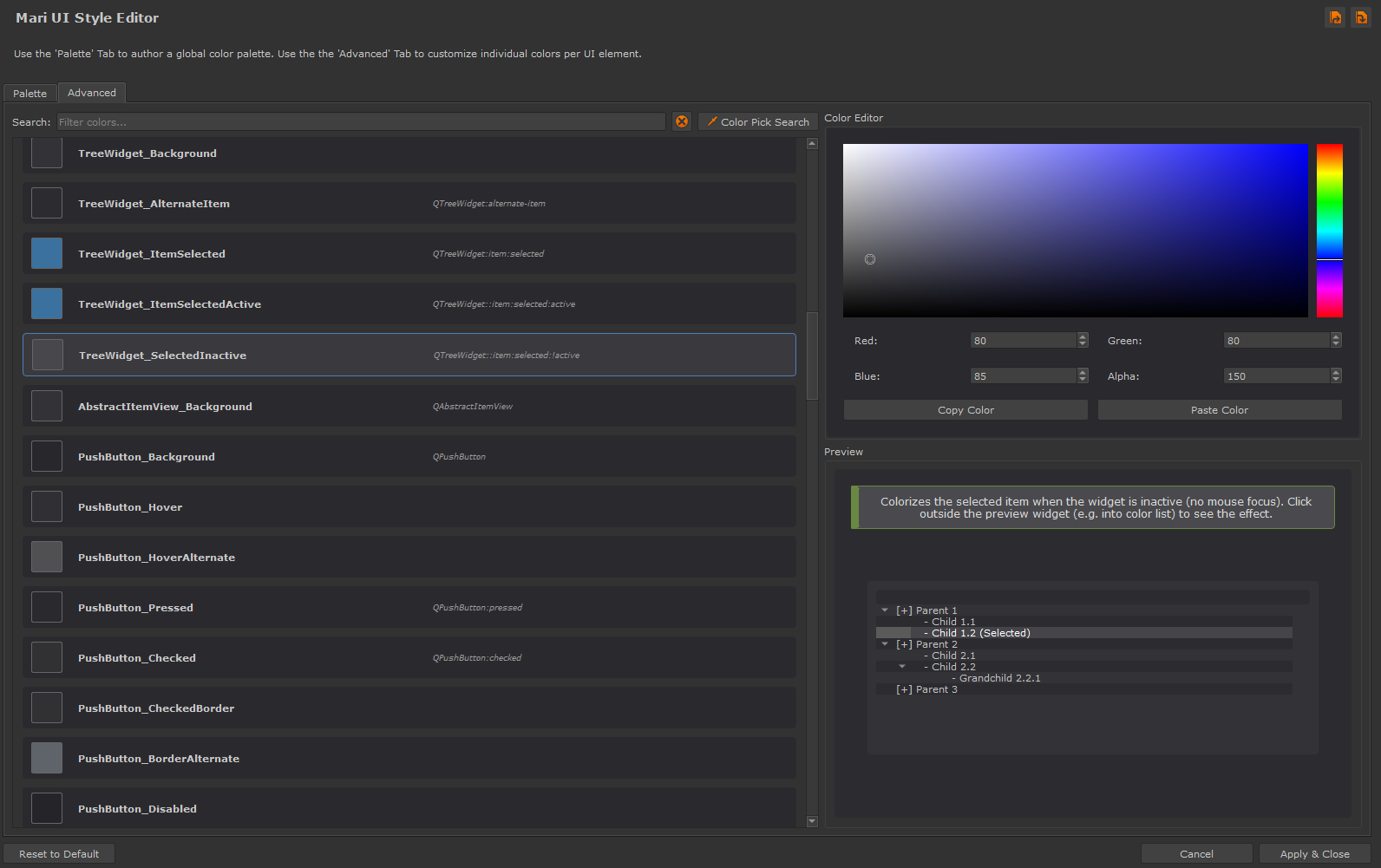
Advanced Tab |
The "Advanced" Tab allows you to dig into the Style of Mari and adjust items and their different states on a per Element level.
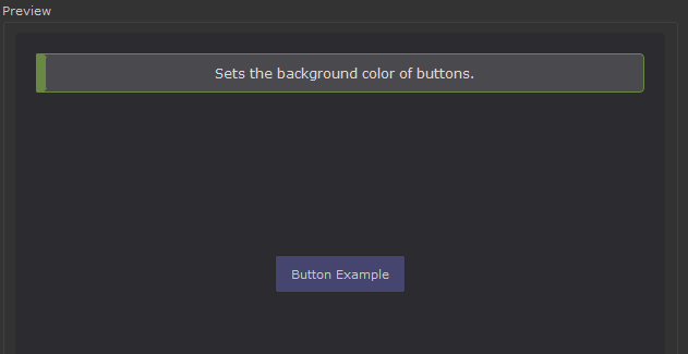
As an example on a regular button you can
•adjust the background color
•adjust the color it is when the cursor if hovering over it
•adjust the border color of the button
•and much more.
|
|
You will have a lot more customization options if you customize based on a Extension Pack Theme, than the Mari Default one. |