|
Hotbox Type: Row Based |
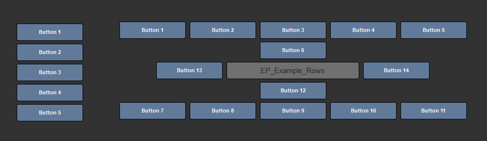
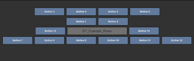
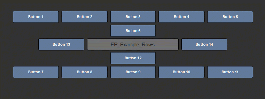
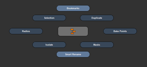
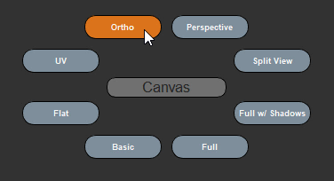
Two separate examples of Row Based Hotboxes. The first one has its Center Button hidden.
Row based Hotboxes come with a set of specific options on top of the general behavior and preset options
The Position Section affects the automatic distribution of buttons
|
|
Individual Button positions can be changed in the Button Settings |
Available Position Settings for a Row Based Hotbox
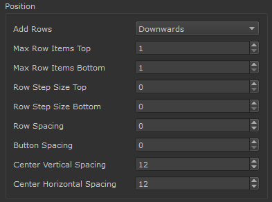
•Add Rows
The Add Rows Setting (Upwards or Downwards) determines where a new row is added once a row reaches the maximum amount of buttons it can hold.
Downwards
Once a row reaches its maximum capacity a new row is added closest to the hotbox center

Upwards
Once a row reaches its maximum capacity a new row is added furthest away from the hotbox center

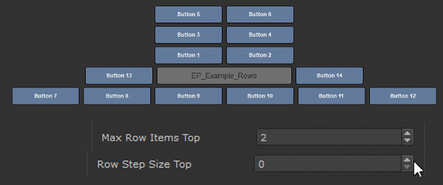
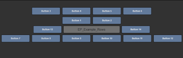
•Max Row Items Top
Determines the maximum number of buttons the Top Section can hold before a new row is added
|
|
The amount of items per row will vary from the entered value if Row Step Size Top is not 0 |

•Max Row Items Bottom
Same as Max Row Items Top only for the Bottom Section, it determines the maximum number of buttons the section can hold before a new row is added
|
|
The amount of items per row will vary from the entered value if Row Step Size Bottom is not 0 |
The Row Step Size Top is a modifier for the Max Row Items Top Setting.
It adds a value per Row to the Max Row Items Top, allowing for the creation of triangular button distribution
The Row Step Size Bottom is a modifier for the Max Row Items Bottom Setting.
It adds a value to the Max Row Items Bottom, allowing for the creation of triangular button distribution
•Row Spacing
Row Spacing determines the vertical space between rows in the top and bottom section
|
|
Row spacing does not affect space between center and first row. Use Center Vertical Spacing Setting for that |
Example of increasing the row spacing
•Button Spacing
Button Spacing determines the horizontal space between buttons in the top and bottom section
|
|
Button spacing does not affect space between center buttons. Use Center Horizontal Spacing Setting for that |
Example of increasing the button spacing
•Center Vertical Spacing
Center Vertical Spacing determines the space between the center and top section and the center and bottom section
Example of increasing the Center Vertical Spacing
•Center Horizontal Spacing
Center Horizontal Spacing determines the space between the hotbox center and buttons in the center section to the left and right of the hotbox center
Example of increasing the Center Horizontal Spacing

The Style Section affects the general look of the buttons.
|
|
Styles can be overwritten per Button in the Button Settings |
Available Style Settings
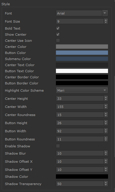
•Font
Determines the font used for buttons
•Font Size
Determines the font size used for buttons
•Bold Text
Sets the Font used for Buttons to use bold lettering
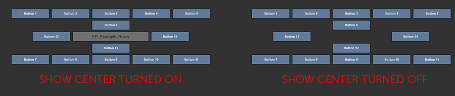
•Show Center
Determines the visibility of the Center Identifier Button of a Hotbox
•Center Use Icon
Allows you to replace the Text Based Center of the Hotbox with a Custom Icon.
If the Option is checked, new options will become visible to set the icon and configure the icon style
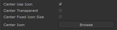
•Center Transparent
The Center Transparent Setting determines if a background is drawn behind the Button Icon.
Please note the option is only available if "Center Use Icon" is checked

•Center Fixed Icon Size
Please note the option is only available if "Center Use Icon" is checked
If on, the original icon size (resolution of supplied image) is used to draw the icon.
If off, the supplied image is rescaled to fill the Center Button Width and Height
•Center Icon
Please note the option is only available if "Center Use Icon" is checked
Select an Image from Disc to display as an Icon if Use Icon is turned on.
|
|
Since icons are loaded each time a hotbox is launched, the icon file size should be as small as possible ! |
While Icon paths are defined as an absolute path, the Hotbox Systems has several methods to locate an icon even
if the file path on disc has changed:
If the file path on disc no longer exists but a file with the name exists in the current Hotbox Folder, this file is used instead.
|
|
It is recommended to always place icon files inside your Hotbox Configuration folder to not loose them |
If an icon is picked from the Mari Installation Folder (e.g C:\Program Files\Mari4.5v1\Bundle\Media\Icons) the path
is automatically converted to a Mari Icon Path, meaning it will always be found regardless
If an icon is picked from the Extension Pack Installation Folder the path
is automatically converted to a Extension Pack Icon Path, meaning it will always be found regardless
•Center Color
Determines the background color of the Center Identifier Button of a Hotbox

•Button Color
Determines the background color of buttons and slider color for sliders
|
|
This setting can be overridden per button in the Button Settings |
•Submenu Color
Determines the background color of buttons that open a submenu

•Center Text Color
Determines the Font Color of the Center Button

•Button Text Color
Determines the Font Color of the Center Button
|
|
This setting can be overridden per button in the Button Settings |

•Center Border Color
Determines the Color of the Center Button Border

•Button Border Color
Determines the Color of the Button Border
|
|
This setting can be overridden per button in the Button Settings |

•Highlight Color Scheme
Determines the Mouse-Over Highlight Color of a Button
MARI HIGHLIGHT COLOR SCHEME
MAYA HIGHLIGHT COLOR SCHEME

 CUSTOM HIGHLIGHT COLOR SCHEME

•Center Height
Determines the Height of the center button

•Center Width
Determines the width of the center button

•Center Roundness
Determines the Corner Radius of the Center Button
|
|
The maximum corner radius is determined by the Center Width and Height |

•Button Height
Determines the Height of buttons
|
|
This setting can be overridden per button in the Button Settings |

•Button Width
Determines the width of buttons
|
|
This setting can be overridden per button in the Button Settings |

•Button Roundness
Determines the Corner Radius of Buttons
|
|
The maximum corner radius is determined by the Button Width and Height |
|
|
This setting can be overridden per button in the Button Settings |

•Enable Shadow
Enables a Drop Shadow Effect on the Hotbox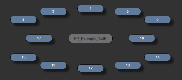
•Shadow Blur
Determines how sharp or blurry the shadow is.
A very blurry shadow might become cut off at its border
•Shadow Offset X & Y
Positions the shadow
•Shadow Color
Set the shadow color
•Shadow Transparency
Define the opacity of the shadow
The Backdrop allows you to define a background plane for your Menu to improve readability and visibility
Example of a number of Buttons placed inside a black backdrop

Available Backdrop Settings

•Show Backdrop
Determines if a Backdrop is drawn
•Width
Sets the horizontal size of the Backdrop
•Height
Sets the vertical size of the Backdrop
•Offset X / Y
Positions the Backdrop
•Roundness
Determines the Corner Radius of the Backdrop
|
|
The maximum corner radius is determined by the Backdrop Width and Height |
•Opacity
Determines the Opacity of the Backdrop
•Color
Determines the Color of the Backdrop